| Customizing the Development Environment |
|
|
Customizing the Development Environment |
|
| Customizing the Development Environment |
|
|
Customizing the Development Environment |
|
Defining a Tag Editor is composed of three tasks:
Open the \Extensions\TagDefs\mytag.vtm file to see how these tasks are coded. The following section will explain how to create the editor file.
| Note | Whenever you make changes to a VTM file or create a new one, save the file, then press Ctrl+Alt+Shift+C to apply the changes. |
This section contains only two kinds of tags: CONTROL and CONTAINER tags. CONTROL and CONTAINER tags represent graphical controls. The tags are identical in definition, with the exception that only CONTAINER tags have the capability to contain CONTROL tags.
A Panel control is a good example of a control that can be a CONTAINER containing a CONTROL, such as Labels or TextBoxes.
Look at the following example:
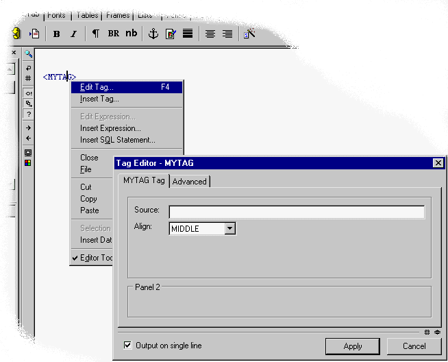
<TAG>

    <EDITORLAYOUT HEIGHT=50 WIDTH=200>

        <CONTAINER  NAME="Panel1" TYPE="Panel" WIDTH=150 HEIGHT=50>

            <CONTROL NAME="lblCode" TYPE="label" CAPTION="Code" DOWN=20

                RIGHT=20 WIDTH=70/>

            <CONTROL NAME="txtCode" TYPE="TextBox" ANCHOR="lblCode"

            <CORNER="NE" WIDTH="30"/>

        </CONTAINER>

    </EDITORLAYOUT>

</TAG>
You can name the above template MYTAG.VTM and test it by attempting to edit an empty MYTAG tag. The tag editor looks like this:
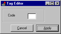
The example displays a single Panel CONTAINER containing Label and TextBox controls. Only a few controls can be containers:
You might have noticed that the control represented by a CONTROL or a CONTAINER tag is defined by the TYPE attribute. We can also see that WIDTH and HEIGHT attributes determine the size.
The ANCHOR and CORNER attributes determine the point relative to which the control is positioned. The ANCHOR can be specified as the name of any control that was already laid down. The corner specifies the corner of the anchor control to be used for positioning. The possible choices are NE, NW, SE, and SW. The DOWN and RIGHT attributes then specify the pixel offset from the anchor control.
The following table describes the CONTROL and CONTAINER tags.
| CONTAINER/CONTROL attributes | |
|---|---|
| TYPE |
Available container types are:
|
| NAME | Name of the control. |
| ANCHOR | (Optional) The name of the control relative to which control is positioned. If omitted, control is positioned relative to the upper left corner of its container. |
| CORNER | (Optional) Corner of the ANCHOR control relative to which offset position is calculated (NW, NE, SW, SE). The default is NW, the upper left corner. |
| DOWN | Offset in pixels down from the anchor point (corner). |
| RIGHT | Offset in pixels right from the anchor point (corner). |
| WIDTH |
Width of the control.
Can be specified in three ways:
|
| HEIGHT |
Height of the control.
Can be specified in three ways:
|
| LFWIDTH | Width of the control used when user's system is set to use large fonts. |
| LFHEIGHT | Height of the control used when user's system is set to use large fonts. |
| MAXWIDTHPADDING | Used with WIDTH=MAXIMUM. Specifies the padding in pixels from the container's right boundary. |
| MAXHEIGHTPADDING | Used with HEIGHT=MAXIMUM. Specifies the padding in pixels from the container's bottom boundary. |
Once the layout of controls is completed one needs to define the way in which the editor controls are populated when you are editing an existing tag. This is done in the ATTRIBUTES block of the main tag editor template.
The ATTRIBUTES block can contain ATTRIB and EVENT tags. The ATTRIB tag defines the way tag attribute values get filled into the dialog controls.
<ATTRIBUTES>

    <ATTRIB NAME="VALUE" CONTROL="txtName"/>

    <ATTRIB NAME="TITLE" CONTROL="txtTitle"/>

    <ATTRIB NAME="TITLE" CONTROL="txtTitle2"/>

    <ATTRIB NAME="ALT" CONTROL="txtAltText"/>

    <ATTRIB NAME="ALIGN" CONTROL="dropAlign"/>

</ATTRIBUTES>
The name attribute of the ATTRIB tag specifies the name of the attribute, while CONTROL specifies which control the value of that attribute should be assigned to. Notice that you can have multiple ATTRIB tags with the same NAME. This is common for more complex tag editor dialog boxes where a single attribute value may have to be filled into multiple controls.
The following special variables can be used:
$$TAGBODY -- This special tag attribute name is used when a control needs to be populated by the body of a tag. An example of such a tag editor is the editor for the HTML tag TEXTAREA. The body of the TEXTAREA tag is filled into the txtTextAreaContent control using the following ATTRIB tag.
<ATTRIB NAME="$$TAGBODY" CONTROL="txtTextAreaContent"/>
$$TAGSTRING and $$WHOLETAGSTRING -- These attributes can be used to populate controls with the start-tag string or the whole tag including its start-tag, body and the end-tag. This allows ActiveX controls to be passed the entire tag for custom processing and specialized tag editor behavior.
$$EmbeddedCodeString -- Represents just the text within a tag. It excludes the tag name, delimiters, and white space outside the text block.
The final stage in the process of building a tag editor is the definition of how a tag gets generated from the date entered into the editor controls. The tag generation logic is stored in the TAGLAYOUT block. This block contains a short template used to generate the final tag string. The markup language used the TAGLAYOUT template that was originally designed for wizards and was therefore called Wizard markup language (WIZML). Because of this, all the tags in this section begin with the WIZ prefix.
See "Building Custom Wizards" for more info on WIZML. A good way to get started is to have a look at the TAGLAYOUT sections of existing HTML tag editors located in the \Extensions\TagDefs\HTML directory.
WIZML is described in a separate section though a few things should be noticed. WIZML supports variables as well as functions. The value of each control of the tag editor is passed to the template using a variable with the same name. Therefore, a ColorPicker named colorBGColor will pass its value in colorBGColor variable. The TAGLAYOUT template can then use this data to generate the tag string.
<TAGLAYOUT>

    <MYTAG COLOR="$${colorBGColor}">

</TAGLAYOUT>
The above example shows a simple layout template for a hypothetical tag with a single attribute COLOR. Notice that in WIZML variables are embedded using the $${} delimiters. If the user chose White in the colorBGColor ColorPicker, the above template would generate the following tag:
<MYTAG COLOR="White">
In addition to the CONTROL variables, a few other parameters get sent to the tag layout template:
You can use this parameter to create a layout template, which generates a tag in lower or upper case based on user preferences. Here is a version of the MYTAG layout template responding to case preferences:
<TAGLAYOUT>


    <WIZIF OPTIONLowerCaseTags EQ 'true'>

        <mytag color="$${colorBGColor}">

    <WIZELSE>

        <MYTAG COLOR="$${colorBGColor}">

    </WIZIF>


</TAGLAYOUT>
The variable EDITORTagIndentString contains an indentation string for the currently selected tag. If the start tag is indented using tabs and characters, the string is represented as the corresponding combination of tabs and spaces. This variable can be used to correctly indent tag attributes, as well as tag body contents for tags which are already indented.
Some people like their tag attributes in a single line while others like them indented. Here is a version of the MYTAG layout template responding to such preferences:
<TAGLAYOUT>


    <WIZIF OPTIONLinearLayout EQ 'true'>

        <WIZSET Spacer = ' '>

    <WIZELSE>

        <WIZSET Spacer =  Chr(13) & Chr(10) & ' '>

    </WIZIF>


    <MYTAG COLOR="$${clrBGColor}"$${Spacer}FACE="$${fontFace}

        "$${Spacer}SIZE="$${txtSize}">


</TAGLAYOUT>
The template would generate a tag based on the following layout preference:
LINEAR:


<MYTAG COLOR="White" FACE="Arial" SIZE="10">


NONLINEAR:


<MYTAG COLOR="White"

    FACE="Arial"

    SIZE="10">
The TagDataUnknownAttributes tag contains the list of attributes that are contained in the original tag string but are not supported by the editor. For example, you can write an editor for the HTML tag INPUT. You can provide editing capabilities for all basic attributes, however the editor will not cover JavaScript event attributes (for example, onCLick). In order not to lose these "unknown" attributes during the editing process, the editor engine creates the TAGDATAUnknownAttributes variable containing a list of unknown attributes together with their original values. You can use this variable to "stamp" all the unsupported attributes at the end of the tag you are generating.
<TAGLAYOUT>

    <MYTAG COLOR="$${colorBGColor}"

    <WIZIF TAGDATAUnknownAttributes  NEQ

    ""> $${TAGDATAUnknownAttributes}</WIZIF>>

</TAGLAYOUT>
If you edited a tag <MYTAG COLOR="Blue" onClick="CallThis">, the above template would preserve the onClick attribute despite the fact that it is not supported in the editor. The editor is also intelligent enough to list the unknown attributes in a linear or indented format based on a user's layout preferences, as described in the previous section.
| Copyright © 2000, Allaire Corporation. All rights reserved. |
|